The Ultimate Guide to Mobile SEO

The Ultimate Guide for Mobile SEO

An optimized site works well with mobile devices, meaning responsive layouts, fewer clicks, and less scrolling. Mobile SEO is not just a marketing strategy. It is a way to increase the visibility of your website on mobile devices.

Mobile SEO refers to optimizing a website to rank well in search engine results when someone searches for a keyword on their phone. Mobile SEO can be done by creating and optimizing mobile-friendly content

Moreover, we need to modify the website structure and optimize navigation options for mobile devices. In addition, it is highly recommended to avoid those mobile SEO mistakes you’re probably making.

Mobile search engine optimization is a topic that is becoming more and more important for businesses to understand. Mobile search engine optimization is not just about optimizing the mobile experience but also about how to rank your mobile site in the SERPs.

This post will walk you through best practices for optimizing your mobile website for the best search engine rankings.

Quick Links

What is Mobile Optimization

Mobile SEO is the process of optimizing a website for mobile devices. With Google’s mobile-first index, it is important to ensure that your website performs well on mobile devices.

It can be achieved by ensuring that your site loads quickly on mobile devices, has a responsive design, and uses text and images optimized for smaller screens.

The use of smartphones and tablets has increased exponentially in recent years. As more people use their phones to search online, it has become increasingly important to have a website that works well on these devices. 

Mobile search engine optimization optimizes websites for mobile devices such as smartphones and tablets.

Mobile Friendly

Why Mobile SEO is importance?

Mobile search engine optimization is an important part of the digital marketing process. It helps to improve the visibility of a website and increase the number of visitors.

Mobile search engine optimization has many benefits, but one often overlooked is how it can help improve your conversion rates on mobile devices. Optimizing your site for mobile devices will boost your conversion rate and increase your revenue as more people can view your content on their devices.

Mobile SEO is a crucial part of digital marketing, and it is important to ensure that your website is optimized for mobile users. The top ten benefits of mobile SEO are as follows:

1. New Customers: Mobile SEO provides an opportunity to reach new customers looking for your business on their phones.

2. Organic Traffic: It helps you get more organic traffic from Google searches.

3. Conversion Rate: It allows you to increase your conversion rates by focusing on the right keywords and offering relevant content to them.

4. Single Website: It allows you to get found in more places with a single website or URL instead of having multiple domains for different devices/platforms/locations, etc.

5. Outrank Competitors: Mobile search engine optimization can help you rank higher than competitors who don’t have a mobile strategy yet, giving your business an advantage in terms of visibility and customer acquisition costs (CAC).

6. More Revenue: It helps you generate more revenue from ad campaigns by increasing engagement with your ads and making it easier for you to grab the attention of the audience you want.

7. Social Media: It allows your business to create more viral reach by reaching new users via social media and email marketing campaigns.

8. User-Friendly Navigation: It can help avoid potential problems associated with slow-loading websites or those that are not mobile-friendly, making it easier for people to navigate your website even when they are on a platform outside of desktop/laptop computers, such as a smartphone or tablet device.

9. Wider Audience: Mobile search engine optimization can also help you reach a wider audience and generate more leads for your business by increasing the amount of traffic a mobile app gets.

10. Google Algorithm: After 2019, Google will prioritize mobile-friendly blogs and websites and encourage mobile-first indexing.

World Mobile Users

Mobile Responsiveness Tester

Mobile Responsive Tester is a tool that helps you test your website for mobile-friendliness. It detects mobile usability issues such as whether the website is responsive, how easy it is to use on a mobile device, and how well it looks on different screen sizes.

It can help you determine if your website is compatible with all devices and screen sizes. It also helps you optimize your site for maximum performance.

Mobile Responsiveness Tester

Components of Mobile SEO

In today’s digital world, mobile users are the majority. As a result, not only do they have a higher amount of time on their hands, but they also have a higher expectation of the quality of the content they are consuming.

This guide will cover many aspects of mobile SEO, from understanding how Google defines mobile-friendliness to optimizing your site for search results.

1)- Page Layout (Responsive Web Design)

Responsive Web Design is an approach to designing websites that can be viewed on all devices. This approach has been around for a while, but it has recently become more popular among mobile-first website owners.

It allows you to create a website that adapts to the size and shape of your visitor’s device. This means your website will look good on any size screen, no matter what type.

The layout automatically adjusts when the visitor moves from one device to another. The most important thing to remember when choosing a mobile responsive layout is to ensure it’s easy for people to use. This means having everything in one place, including buttons, navigation menus, and images.

Mobile responsive Design

Image Source: Google Search Central

2)- Page Speed (Site Load Time)

Google’s algorithm is designed to reward sites with fast loading speeds on mobile devices. This means that the more optimized your website is, the higher your rank in Google.

Mobile SEO is about making your website load faster on mobile devices and ranking higher in Google’s search results.

In other words, page speed is a crucial factor for both mobile and desktop SEO. It can be measured in milliseconds and is important for user experience and conversions.

The following are some of the factors that can affect the load time of your site:

  • The number of assets loaded on the page (images, videos, etc.)
  • The number of scripts running on the page (JavaScript, CSS, etc.)
  • The size of those assets
  • The composition of the page (all JavaScript, no images, many images)
So it would be best to learn how to boost page speed and accelerate website loading time.
Mobile page Speed

3)- Image Optimization

Optimize websites for the mobile platform; image optimization plays a crucial role in Mobile SEO. Image optimization includes things like size and quality. A website with low-quality images will not rank well on Google’s search engine results page (SERP).

Therefore all SEO experts agree that the most important part of mobile SEO is image optimization. This means you need to optimize your images to make them load quickly on mobile devices. 

There are multiple ways to do this, but the most effective is using a tool like Google’s Image Optimizer, Adobe’s Optimizer Pro, or Optimizilla.

Compress JPEG Image Online Free

4)- Mobile Navigation (Clean and Easy to Use)

Mobile navigation is an important factor in building a mobile-friendly website. Mobile navigation should be clean and easy to use with clear calls to action so that users can quickly find what they are looking for without going through multiple screens or pages.

The importance of mobile navigation has increased significantly in recent years because of the rise in smartphone usage and the increased competition for user attention on smartphones.

Mobile navigation can be a tricky one to get right, but it’s not impossible. With the right tools and practices, you can make your mobile site clean and easy to use while getting all the benefits of SEO.

In other words, mobile navigation is one of the most important parts of a website, and it should be clean and easy to use. This can help with user experience and conversions.

Mobile-friendly navigation is a design pattern that focuses on how the website’s content is presented and navigated on mobile devices.

It helps with the design and usability of a website. The user can easily navigate the site without switching between different pages constantly by having an easy-to-use, responsive, and intuitive interface.

Mobile-friendly navigation allows quick access to important features like search bars, social media icons, and contact information.

It also opens opportunities for new features like video content or interactive maps.

Mobile Navigation

5)- Fat Finger Scrolling (Thumb Friendly Design)

Mobile SEO is a very important aspect of SEO because it is the first and foremost way that users experience your website.

Thumb-friendly design is a term used to describe websites with an interface easily navigated with only one hand or thumb. This design makes it easier for users to navigate through content on mobile devices like smartphones, tablets, and laptops.

Benefits of Thumb-friendly design:

  1. Faster page loading time – The faster page loading time allows more people to stay on the site longer and consume content in less time.
  2. Better user experience – Thumb-friendly design increases engagement with customers as they can easily browse through content.
  3. Increased customer loyalty – Thumb-friendly design allows customers to easily navigate and find out what is available on the site.

6)- Title and Meta Description Optimization

Mobile SEO is a critical part of any mobile marketing strategy. Optimizing your website for mobile is important to ensure that your users get the best experience possible when they’re on the go.

The title and meta description optimization is something you should consider when you’re looking for ways to improve your mobile SEO.

The meta description summarizes your website and should be one sentence long. The tile image should be in the form of an icon placed at the top or bottom of the screen while browsing a list of websites.

7)- Focus on UX (User Experience)

Mobile SEO optimizes a website for user experience when accessed through mobile devices.

This process involves learning how users interact with your website and making changes to increase the user experience. In addition, it requires creating content optimized for mobile screens and using different strategies, such as responsive design, to ensure that your website works well on all devices.

The first step in mobile SEO is understanding how users use your site, which can be done by watching them or conducting usability tests. You may also want to create personas based on these findings, which are specific groups of users with common characteristics and goals.

Mobile page experience has four basic components as below:

1)- Core Web Vitals

A core web vital is a part of your website that will help you rank on the first page of Google. It should be unique and contain content not found on the first page. It should also be linked to other important pages on your site.

For instance, if you are a food business, then your core web vital might be recipes or a blog post about cooking techniques. Website core web vitals have three primary parts:

A)- Largest Contentful Paint (LCP)

The largest Contentful Paint is a benchmark for measuring a website’s performance—the total number of bytes that can be transferred to and from a site.

Largest Contentful Paint (LCP) is an important metric used to measure performance. 

It helps determine how visitors will access fast website content. 

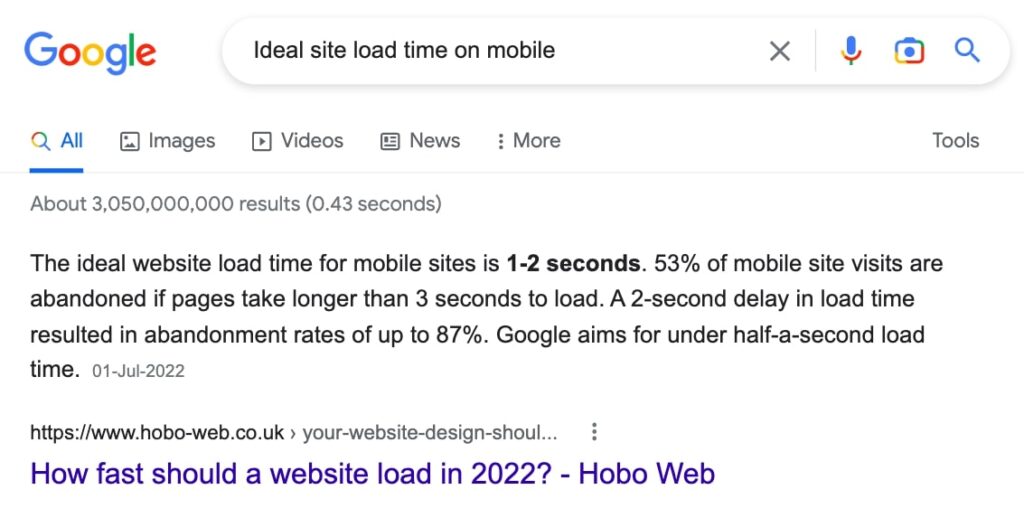
LCP should not be confused with load time, which measures how long it takes for a web page to load.

Ideally, it requires 2.5 seconds to load the largest contentful paint.

Largest Contentful Paint (LCP) Ideal Time

LCP

B)- First Input Delay (FID)

First Input Delay (FID) is when a user clicks on a link, and the content begins to load. It can be measured in milliseconds and measure how responsive a website is.

The FID can impact the usability of a website, as it is one of the primary indicators that determine how quickly users can navigate through your site. 

A low FID will make it easier for users to find what they’re looking for and navigate your website more easily.

A high FID will cause frustration for visitors, as they will have to wait longer for their content to load before they can start browsing through your site. 

This could lead them to leave or look elsewhere for what they want.

Ideally, it should be less than 100 milliseconds.

c)- Cumulative Layout Shift (CLS)

Cumulative Layout Shift is a design pattern that is used in web design. The design pattern allows the navigation bar to expand and contract with the content.

The CLS pattern can be found on websites like Facebook, Google, or Amazon. The first stage of this design pattern is to have an expansive navigation bar on the left side of the screen.

The second stage is to have a content column that expands into a sidebar when needed. This design pattern has been used for decades, but recently, it has become more popular due to new responsive web designs and mobile-first development methodologies.

It allows designers to create fluid layouts by having flexible navigation bars that can change with different-sized screens and varying content levels.

2)- Mobile Friendliness

Mobile Friendly Test is an online tool that helps businesses understand if their website is mobile-friendly. It’s a free service that tests the mobile-friendliness of a website.

The test checks for common usability issues like whether the site has a responsive layout, clear text and images, and whether it’s easy to find content on the homepage.

3)- HTTPS Security

The importance of HTTPS security features is not only for the user experience but also for the website’s security.

It provides a secure connection between your browser and the server. In addition, it encrypts information sent and received, so it’s impossible to see what you are sending or receiving.

HTTPS encryption also prevents man-in-the-middle attacks. These attacks occur when someone in between your browser and server tries to intercept sensitive information, like passwords or credit card numbers. An attacker could use this technique to steal personal information from you while you browse the internet.

4)- Not using interstitial ads/pop-ups

Interstitials are the most common type of ads that you will find on websites. They are the first thing that users see when they visit a website and can be intrusive.

Web pages without interstitials have a better user experience and are less likely to cause eye strain amongst users. The best way to avoid interstitials is by using a header banner or an image as your first impression.

8)- Prominent Call-to-Action

Mobile SEO is a crucial aspect of any business. Mobile search engine optimization ensures that your website ranks higher on mobile search results. This is done by optimizing the content for mobile devices, ensuring that it has a prominent call-to-action, and using relevant keywords.

A Call-to-Action is a button that directs the user to take some action. It is important for mobile SEO because it helps to increase conversions.

Call-to-Action buttons are crucial for mobile SEO because they help to increase conversions and improve click-through rates. A CTA button can be placed at the beginning of your content or the end of your content.

A prominent call-to-action is crucial to encourage visitors to convert from viewers to buyers or customers.

9)- Content Topography (Font Size)

Mobile search engine optimization is a complex topic with many factors that contribute to the success of a website. One of the most important factors is the content on a website, which many business owners and marketers often overlook.

The text size can impact its performance on mobile search engine results pages (SERPs). This article will discuss how font size can affect your SERP ranking and why it’s important to consider this when designing your mobile site.

Font Size for Mobile SEO

10)- Keep Checking Constantly

Mobile SEO is constantly evolving, and while it is important to check to ensure that mobile SEO parameters are fulfilled constantly, it is also important to maintain a healthy workflow. This can be done by creating an editorial calendar.

A good editorial calendar should show what type of content you will produce every month and how often you will produce those pieces of content. You should also set up your editorial calendar to include weekly meetings with the team members working on the content and the task list for each member.

This ensures that everyone in the company knows what they need to do for their respective tasks and keeps track of when tasks are assigned and completed.

Final Thoughts

Mobile SEO is important for both search engine optimization and user experience. But unfortunately, it’s difficult to do because of the sheer number of devices with different operating systems, screen sizes, and resolutions.

It includes a lot of different factors that are unique to each device. With this in mind, it can be hard to know what factors are more important than others.

However, one clear thing from all the data available is that content needs to be mobile-friendly if you want your website to rank well on mobile devices.

The summary of basic six mobile SEO are as:

1. Check your site speed

2. Ensure that you have a mobile-friendly design

3. Improve your site’s usability

4. Use responsive images on your site

5. Add more content to your site and improve the quality of it

6. Optimize for mobile devices

Mobile SEO is the part of SEO that deals with optimizing websites for mobile devices. Therefore, it is important to ensure that your website is found easily on mobile search results.

Mobile optimization can be done using responsive design, mobile-friendly coding, and a mobile-friendly URL structure. Mobile SEO also allows you to rank higher in search engines like Google and Bing when targeting a specific device type or sub-category.

Mobile SEO has been growing rapidly over the past few years due to the increasing number of smartphone users worldwide.

Sharing is Caring

Share on facebook
Facebook
Share on twitter
Twitter
Share on linkedin
LinkedIn
Share on whatsapp
WhatsApp
Share on email
Email

Leave a Comment

Your email address will not be published. Required fields are marked *