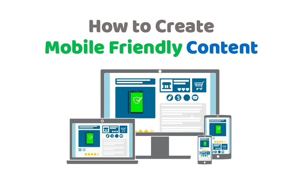
Mobile-friendly content is content that can be easily readable on a smartphone or tablet. We must change how we think about mobile-friendly content, as it is not just for smartphones but any device with a screen.
It can be anything from text, images, videos, and interactive graphics. The key is ensuring the content has a clear hierarchy and easy navigation with minimal scrolling.
Mobile-friendly websites are easier to navigate with less scrolling and more focus on the main information they want their visitors to see. Therefore, mobile-friendly content creation is important to the website’s mobile optimization.
They also provide an optimal experience for people using small screens such as smartphones or tablets. Therefore, mobile optimization is crucial in content marketing and On-Page SEO. It helps in generating more leads and increases conversion rates.
Quick Links
What is Mobile-Friendly Content?
Mobile-friendly content is making your website work well on mobile devices like smartphones, tablets, and other mobile platforms. It must be easy for users to navigate the website and quickly find what they are looking for without having to scroll through an entire site.
Mobile-friendly content has become a big thing these days. Many companies are investing in this technology to make their websites look more aesthetically appealing and make it easier for users to browse through their sites.
Creation of Mobile-Friendly Content
Mobile-friendly content creation is not a new concept. It has been around for a while and is one of the most important trends in the digital marketing industry.
The term “mobile-friendly” refers to websites optimized for mobile devices, such as smartphones and tablets, which account for about 53.38% of global internet traffic, according to Research.com.
A recent survey by Google showed that people who read on mobile devices spend twice as much time reading compared to those who read on desktop computers or laptops.
Mobile users have different needs and expectations when reading a blog post. For example, they expect short, concise, and easy-to-digest content. This means making your website mobile-friendly is vital to attract more readership and increasing conversion rates.

"Before, mobile-friendly content was an optional choice. Now it's a requirement."
1)- Strong Introductory Paragraph
The importance of a strong introductory paragraph as a structure in your writing. The introduction should be clear, concise, and compelling to the reader. In addition, it should give them a sense of what you are about to read and what they can expect from the rest of the piece. Usually, visitors stay for Less than 3 Minutes on Websites.
Readers are increasingly using mobile devices to read the content. So, the introduction of your content must be engaging for them. In addition, it should be relevant and coherent to your main theme and topic.
2)- Font Size Matters
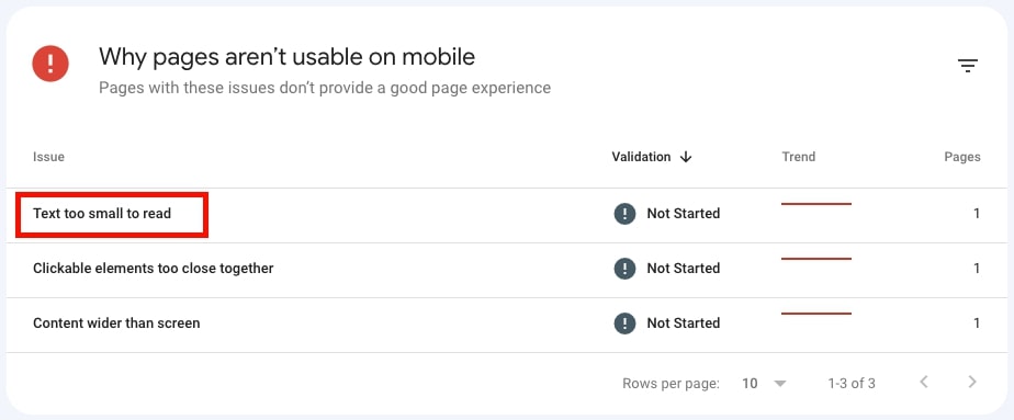
The size of the font on a website can affect its readability. The size of the font on mobile devices is different from the size of the font on desktop computers.
The difference in the font sizes on mobile devices is because the text is typically smaller and more difficult to read than on desktop computers.
Mobile content should be written so that it is easily readable and does not take up too much space on the screen. It is important to keep the font size of your content above 12px to ensure that it looks good on all devices.

It’s been said that 16px font size is the ideal typeface for mobile users, as it allows easy reading on a small screen and fits in with modern website design.
3)- Short Sentences
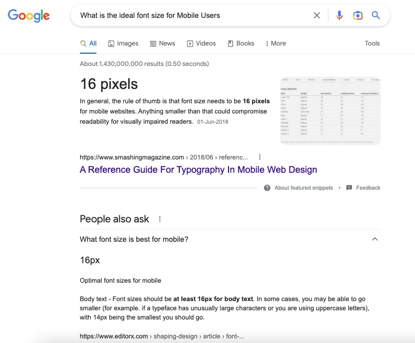
Sentence length matters when it comes to mobile users. Long sentences can be difficult to read on a small screen and can cause confusion. On the other hand, short sentences are easier to read and comprehend on a small screen.
The average sentence length in English is about 50-60 characters long (including space).

4)- Short Paragraphs
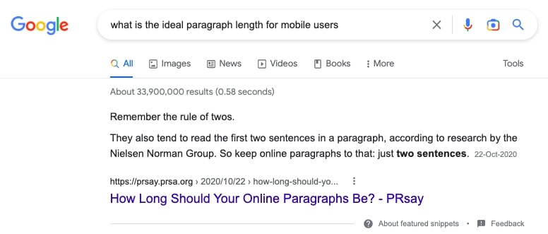
Two Line Short Paragraphs are ideally best for Mobile Users
Mobile users are increasingly becoming the majority of the world’s population. As a result, they need to be able to access content on their phones too. Two Line Short Paragraphs is a type of content that can be easily read and understood on mobile devices.
5)- Bullet Points
One of the best ways to make sure your blog post is optimized for mobile is to use bullet points. Bullet points are a great way to break up long paragraphs and make them easier for your readers to scan through. They are also another way of keeping your content more concise and easier to digest.
6)- Heading and Sub-Headings
The use of headings and sub-headings has been used since the beginning of time. It is a way for people to find their way through content.
If you have a blog post that has been written with headings and sub-headings, then users will be able to find what they are looking for much faster.
Headings and sub-headings are not just good for desktop users, they are also good for mobile users as well.
Mobile users can easily scan through the content by using their fingers or thumbs on their screen. The more text that is condensed on one page, the harder it becomes for mobile users to scroll down and find what they need in a blog post.
7)- Offer a Summary (Final Words)
A summary is a short paragraph that summarizes the main points of a blog post. It is typically placed at the end of the blog post and it’s purpose is to capture readers’ attention and keep them reading.
The best place for a summary is at the end of your blog post. It will help your reader understand what they just read, which can be especially important for mobile users who may have difficulty scrolling through long posts.
8)- Add Video and Image
Adding videos and optimized images in blog posts is one of the best ways to improve your blog’s mobile experience. This will allow mobile users to view your content more engagingly and interactively.
It will improve your site’s performance and increase the chances of your content being shared on social media.
9)- Remove Repeated Content
Repeating the same content in blog posts is a common practice for many bloggers. But, this practice can be detrimental to mobile users.
This is because it takes a lot of time to scroll through a long post to find the content they are looking for. Unfortunately, it also makes it harder for readers to find relevant information and navigate the post quickly.
The best way to make your blog posts more accessible on mobile devices is by removing repeated content and making sure that you are using short paragraphs with clear headings.
Repeated content is the bane of mobile users. They have a short attention span, and it’s easy for them to get bored with too much text on a page.
By cutting down on repeated content, your blog post will be more engaging for mobile users, and they will spend more time on your site.
10)- Review and Revise
The best way to improve your content is to review and revise it. One of the ways you can do this is by using a mobile app called Grammarly.
Grammarly helps you with grammar, spelling, and style mistakes. It also provides recommendations for how to make your content more engaging. You can use the app on your computer or your phone to ensure that your content is up-to-date and has the best impact on its audience.
One of the most important things you can do to ensure that your content is fresh and up-to-date is to revise it regularly. It will help you avoid confusion or misunderstanding with your readers and keep them engaged.
Final Words
Mobile users are increasingly becoming the majority of the world’s population. As a result, they need to be able to access content on their phones too.
Mobile users are more likely to scroll through a blog post than read it. Therefore, it is important to consider the user experience when writing content.
Summary of the top ten tips for creating content for mobile devices are as below:
- Introductions should be short, relevant, and easy to read on a cell phone. They should be focused on the benefits of reading your content and how it will help people achieve their goals.
- The 16px font size is ideally best for mobile users. It is the most commonly used font size on mobile devices and is easy to read on small screens.
- The truth is that the average sentence length on mobile devices is about 50-60 characters.
- The two-line short paragraph is an ideal type of content for mobile users because it contains minimal text and can be read in less than a minute.
- Bullet points are best for mobile users because it is easier to scan through the text and find what they need without scrolling.
- Heading and Sub-Heading in the blog post are best for Mobile Users. This is because mobile user has less time than desktop users, and they need to be able to scan or skim through the content quickly.
- Mobile users are more likely to read a summary of a blog post than an entire blog post. Therefore, mobile users often use a summary to provide them with the key takeaways from the blog post.
- The most effective way to make your blog post accessible for mobile users is by adding a video or optimized image.
- Mobile users are the most important audience and must be catered to. The best way to do this is by removing repeated content in blog posts.
Reviewing and revising your content is best for Mobile Users article will help you understand how to optimize your site and make it easier for people to read on their mobile devices.
Sharing is Caring

